
The Design Process
Throughout the creation of the rough draft, I first brainstormed what design would flow perfectly with a yoga pose. I knew that yoga provides me with peace and that a peace sign would look cool made with a yoga pose but I wasn’t sure which pose to do specifically. There wasn’t a perfect pose that fit into a peace sign so I had to think of one more thing I could include to complete the look.
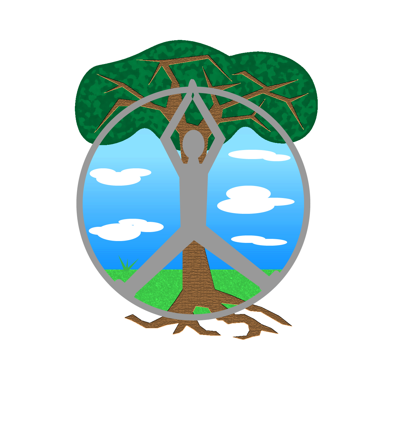
I sketched out the pose called the upward salute with a little twist on it to fit more into a peace sign. I also correlate peace with nature and nature with trees. I knew that a tree would be the perfect thing for the last leg of the peace sign, it also shows more symbolism than just peace and yoga. It also revolves around the interpretation that peace can be found in nature and yoga.
The naked eye at first glance may not fully notice the peace sign but after a long look it hopefully is noticeable. After this sketch I needed to bring the design process to life in Adobe Illustrator. I began with creating a circle out of the shape tool. Then, morphed the human out of different shapes and colored the person in with black fill. The tree was shaped out of the shape tool as well and filled in with green and brown in front of a blue sky. This was a very basic rough draft and I knew that there was much more that could be done.
Final Draft
My final draft consisted of making the human and tree a bit more lifelike. Taking my classmates advice, I redrew the tree so that it stood out from the human in front of it. I drew roots and the tree trunk at a bit of an angle. My favorite part of this was adding special effects to the grass, tree trunk, and the top of the tree. I felt that this really added a whole different dimension to the design and showed character. Though logos are meant to keep simple, I felt that this logo would look perfect at a smaller size as well, it’s different and recognizable.
Tips:
I didn’t do much research to create my design other than look up the name of the yoga pose that I was going to be drawing so I could mention it in the description. The main advice I give to my class mates is to experiment with the special effects tab, it can really change everything and make it look ten times better.
