
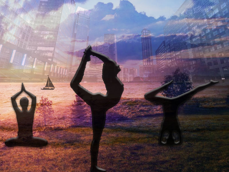
For this graphic design project, I decided to incorporate yoga flow and its versatility! My whole blog basically revolves around yoga and how my life has been affected by yoga, so in this project I wanted to provide the eye with a story through imagery!
I saw a couple ideas for graphic design online of overlapping different images and lowing the opacity, I really liked this idea, so I decided to incorporate it into my project. Going through the tutorials once again from class and online YouTube videos were a great help when I was looking for more ways to improve my work or just as a reminder of how to use the pen tool!
I first looked online for references and images that I could use for my project, of course under a creative commons license. I had a completely different idea before putting it into Photoshop but when I actually tried everything together it didn’t look very professional or creative, so I decided to restart and find different images to flow together better.
I knew I wanted to chose 3 background images that were completely different from each other but represented areas that people can do yoga. The beach, ocean, and just in beautiful nature are three very distinct places that people are able to do yoga. I searched for the perfect images that fell under a creative commons license and just mashed them together as best as possible. Next, I knew I loved the idea of silhouettes places perfectly in-front of the beautiful backgrounds, so I made my own silhouette out of a woman doing yoga. The final version gives more of a rainbow/colorful effect compared to the draft before, I like how this brightened up the image. Brightening up the image was actually suggested by a student on blackboard responding to my discussion post.
I used the special effects a lot when finding different outlining techniques and lowing the opacity to make everything blend better. It really helped playing around with the blending options and image effects to make it overall look better.
At first, I had forgotten which pen/ lasso was better to use when vectoring the woman’s yoga pose, it took a while but after I did some testing and looking back on the tutorials, I figured out how to do it pretty quickly. The main challenge was figuring out what images went good together and how I should place them. I did want to make different sectors for each image with different poses to create more of a yoga “flow” but I did not want to make it look like a collage or not blend well together so figured how I had it, was the best way to go. I was honestly satisfied with how my rough draft looked but after receiving some constructive criticism from classmates I decided to mess around a bit more with the contrast, brightness, and vibrancy of the image as well as the opacity to see if I could make it look any better. To my surprise I tweaked it a bit here and there and was really satisfied with what I had done and how much it had improved.
https://en.wikipedia.org/wiki/File:Panambur_Beach_Mangalore.jpg#filelinks
https://commons.wikimedia.org/wiki/File:Mr-yoga-lord_of_dance_-_both_arms.jpg#filelinks
https://www.vexels.com/png-svg/preview/166261/cruising-yacht-ship-silhouette
https://www.maxpixel.net/Nature-Landscape-Fog-Grass-Mist-Dusk-Dawn-1850105
